


➡️ Back to the basics
New month, new challenge

This is the 2nd post of the Practice File, a monthly space to approach creative work like the gym: small exercises, recurrent practice, no pressure for perfection.
If you want to know more about it, check below 😊

First month challenge, on contrast!
✳️ Here it’s a little recap of the work done by many members on the first month of the challenge.

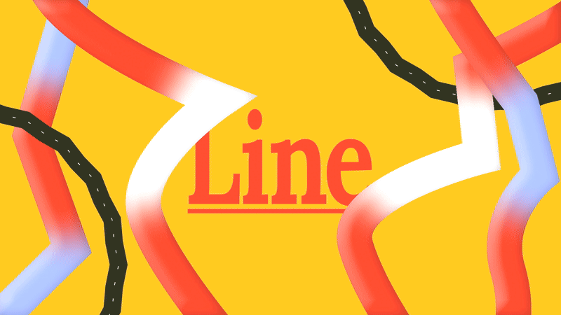
The Practice File #02 — Line
So! This month we are working with Lines :—————)
We can start by mentioning that a line is the most fundamental element of design, defined as a shape that connects two or more points. It's a path traced by a moving point, and its character can vary infinitely. Lines are everywhere, from illustrations to the structure of a layout, of a grid, where they set the base of the content within it :).
*To check the rest of the post, the creative challenge, have access to the group to submit your work, get comments and more become a paid subscriber. You can always refer 3 friends and get a month free :)To first start with a Line as an element, let’s break down its properties:
Weight refers to its thickness. A heavy, thick line demands attention and can feel bold or stable, while a thin line is more subtle.
Style is about its form; straight, curved, wavy, or jagged for example. Each style carries a different energy. Straight lines feel ‘in order’, curved lines feel more organic and dynamic, and jagged lines can evoke excitement or tension.
Direction influences the mood. Horizontal lines suggest stability, like the horizon. Vertical lines can convey height and strength. Diagonal lines are full of energy, suggesting movement and action.
In practice, lines guide the viewer's eye, divide space, and connect related elements.