


Start Here! ➡️ 1st exercise: Contrast
The first of the Practice File group journey

This is the first post of the Practice File, a monthly space to approach creative work like the gym: small exercises, recurrent practice, no pressure for perfection.
If you want to know more about it, check below 😊


The Practice File #01 — Contrast & Hierarchy
“Hierarchy, the system in which elements are organized according to their importance or status, is vital for graphic designers and determines how the audience will receive the presented information.
The absence of hierarchy can cause a loss of information or confuse the reader about the order in which to read the piece.
Attention is a luxury we can’t take for granted. A design that fails to guide the eye may block the transmission of information.”
(Theo Inglis, The Graphic Design Bible)
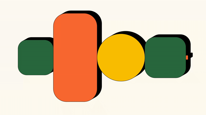
We’re kicking off the first Practice File by using hierarchy as the backbone for working on contrast.
Hierarchy is what gives your work structure.
It’s how you guide the viewer’s eye, making sure they know what to look at first, second, third.
*To check the rest of the post, the creative challenge, have access to the group to submit your work, get comments and more become a paid subscriber. You can always refer 3 friends and get a month free :)